編集ダイアログ
ノードの編集ダイアログの主な用途は、 ユーザーが望む動作をノードに設定することです。
ダイアログは直感的に利用でき、 そのデザインおよび外見が他のノードと一貫性がなければなりません。
編集ダイアログはノードのHTMLファイル内の
<script>タグから生成されます。
<script type="text/html" data-template-name="node-type">
    <!-- edit dialog content  -->
</script>
<script>タグのtypeはtext/htmlにします - これにより、テキストエディタが適したテキストハイライトをおこないます。 また、ノードがエディタに読み込まれた際、 通常のHTMLコンテンツとなることからブラウザを保護します。- タグには編集ダイアログのためにノードの種類を示す
data-template-name属性をセットします。 特定のノードを編集するときに どのようなコンテンツを表示すべきかをエディタに伝えます。
編集ダイアログは一般的に行から構成されます。 それぞれの行には異なるプロパティに対するlabelとinputが含まれます。
<div class="form-row">
    <label for="node-input-name"><i class="fa fa-tag"></i> Name</label>
    <input type="text" id="node-input-name" placeholder="Name">
</div>
- 各行は
form-rowクラスをもつ<div>から生成されます。 - 一般的な行はアイコンと
<input>と一致するプロパティの名称を含んだ<label>を持ちます。 アイコンは<i>要素を利用して生成され、 Font Awesome 4.7から利用可能なクラスを持ちます。 - プロパティを含むフォーム要素は
node-input-<propertyname>というid属性が必須です。 設定ノードの場合、id属性はnode-config-input-<property-name>となります。 <input>のtype属性は、 stringおよびnumberのプロパティにはtext、booleanのプロパティにはcheckboxとします。 また、選択肢が制限されている場合には<select>要素を使うことができます。
Node-REDはいくつかの標準UIウィジェットを提供しており、 よりリッチで一貫性のあるユーザーエクスペリエンスを作り出すことができます。
ボタン
編集ダイアログにボタンを追加するには、
一般的な<button>HTML要素を利用し、red-ui-buttonクラスを付与します。
プレーンボタン |
<button type="button" class="red-ui-button">Button</button> |
スモールボタン |
<button type="button" class="red-ui-button red-ui-button-small">Button</button> |
トグルボタングループ |
<span class="button-group">
<button type="button" class="red-ui-button toggle selected my-button-group">b1</button><button type="button" class="red-ui-button toggle my-button-group">b2</button><button type="button" class="red-ui-button toggle my-button-group">b3</button>
</span>
HTML $(".my-button-group").on("click", function() {
$(".my-button-group").removeClass("selected");
$(this).addClass("selected");
})
oneditprepare 活性化しているボタンに 注意: |
入力
シンプルなテキスト入力には、標準的な<input>要素を利用することができます。
場合によっては、Node-REDは代替としてTypedInputウィジェットを提供しています。
これによってユーザーはプロパティとその値の型を指定することができます。
例えば、プロパティをString、Number、booleanに指定できます。 また、メッセージプロパティ、フローまたはグローバルコンテキストプロパティを指定するように利用できます。
このjQueryウィジェットを編集ダイアログページに追加するためには、
ノードのoneditprepare関数にコードを追加する必要があります。
TypedInputウィジェットの全APIドキュメントは、
利用可能なビルトインされている型一覧も含めてこちらで入手できます。
プレーンなHTML Input |
<input type="text" id="node-input-name"> |
TypedInput
|
<input type="text" id="node-input-example1">
<input type="hidden" id="node-input-example1-type">
HTML $("#node-input-example1").typedInput({
type:"str",
types:["str","num","bool"],
typeField: "#node-input-example1-type"
})
oneditprepare TypedInputに複数の型をセットするとき、 型に関する情報をストアするための追加プロパティが必要となります。 これはhidden属性をもつ<input>として編集ダイアログに追加されます。
|
TypedInput
|
<input type="text" id="node-input-example2"> HTML $("#node-input-example2").typedInput({
type:"json",
types:["json"]
})
oneditprepare JSON型には専用のJSON編集ダイアログを開くボタンが含まれます (このデモでは無効化されています)。 |
TypedInput
|
<input type="text" id="node-input-example3">
<input type="hidden" id="node-input-example3-type">
HTML $("#node-input-example3").typedInput({
type:"msg",
types:["msg", "flow","global"],
typeField: "#node-input-example3-type"
})
oneditprepare |
TypedInput
|
<input type="text" id="node-input-example4"> HTML $("#node-input-example4").typedInput({
types: [
{
value: "fruit",
options: [
{ value: "apple", label: "Apple"},
{ value: "banana", label: "Banana"},
{ value: "cherry", label: "Cherry"},
]
}
]
})
oneditprepare |
TypedInput
|
<input type="text" id="node-input-example5"> HTML $("#node-input-example5").typedInput({
types: [
{
value: "fruit",
multiple: "true",
options: [
{ value: "apple", label: "Apple"},
{ value: "banana", label: "Banana"},
{ value: "cherry", label: "Cherry"},
]
}
]
})
oneditprepare The resulting value of the multiple select is a comma-separated list of the selected options.
|
複数行テキストエディタ
Node-REDはAceコードエディタを元にした複数行テキストエディタを持っていますが、 ユーザ設定で有効化されることでMonaco editorを使うことができます。
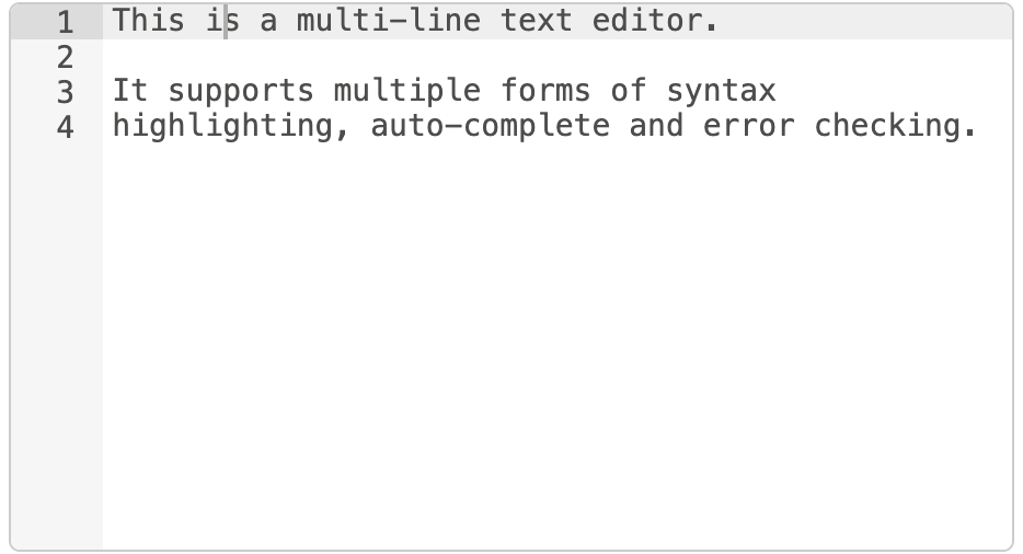
複数行テキストエディタ
以下の例では、編集するノードのプロパティをexampleTextと呼びます。
HTMLに、エディタのための<div>プレースホルダーを追加します。
この要素にはCSSクラスのnode-text-editorが必須です。また、要素にheightを設定する必要があります。
<div style="height: 250px; min-height:150px;" class="node-text-editor" id="node-input-example-editor"></div>
ノードのoneditprepare関数において、
RED.editor.createEditor関数を使ってテキストエディタのイニシャライズをおこないます:
this.editor = RED.editor.createEditor({
   id: 'node-input-example-editor',
   mode: 'ace/mode/text',
   value: this.exampleText
});
ダイアログを閉じる際にエディタから値を取得するため、
ページからエディタを適切に消すために
oneditsaveおよびoneditcancel関数も設定する必要があります。
oneditsave: function() {
    this.exampleText = this.editor.getValue();
    this.editor.destroy();
    delete this.editor;
},
oneditcancel: function() {
    this.editor.destroy();
    delete this.editor;
},